Chromotherapy: How the Visual Spectrum Shapes Your Emotional Reality
Why the colors in your environment are doing more than just looking good—they are actively altering your serotonin and mood stability.
Dr. Ari Chen
Materials Scientist & Research Lead
Color PsychologyMental HealthNeuroscienceDesign
Written By
Dr. Ari Chen
Deep diving into the chemistry of silicone, the physics of vibration, and the biology of pleasure. Where safety meets science.
The Inner Circle
Unlock 15% Off
Join our newsletter for expert intimacy tips, discreet guides, and exclusive member-only offers.
I walked into a friend's apartment recently and immediately felt... off. Nothing was wrong, exactly. The place was clean, well-furnished. But something about the harsh white overhead lights and the neon accent wall made my shoulders creep up toward my ears. I couldn't relax. That's when it hit me: color isn't just decoration. It's not just about what "looks good" on Instagram. Color is a specific frequency of light that interacts directly with the pineal gland and the hypothalamus. In the hyper-visual landscape of 2026, we're finally starting to understand that our environment's color palette acts as a silent architect of our mental state. From the punishing blue light of our devices to the warm ambers of a well-designed living space, every hue we consume is a neurochemical instruction. And most of us aren't even reading the label.
1. The Pineal Gland and the Science of Light
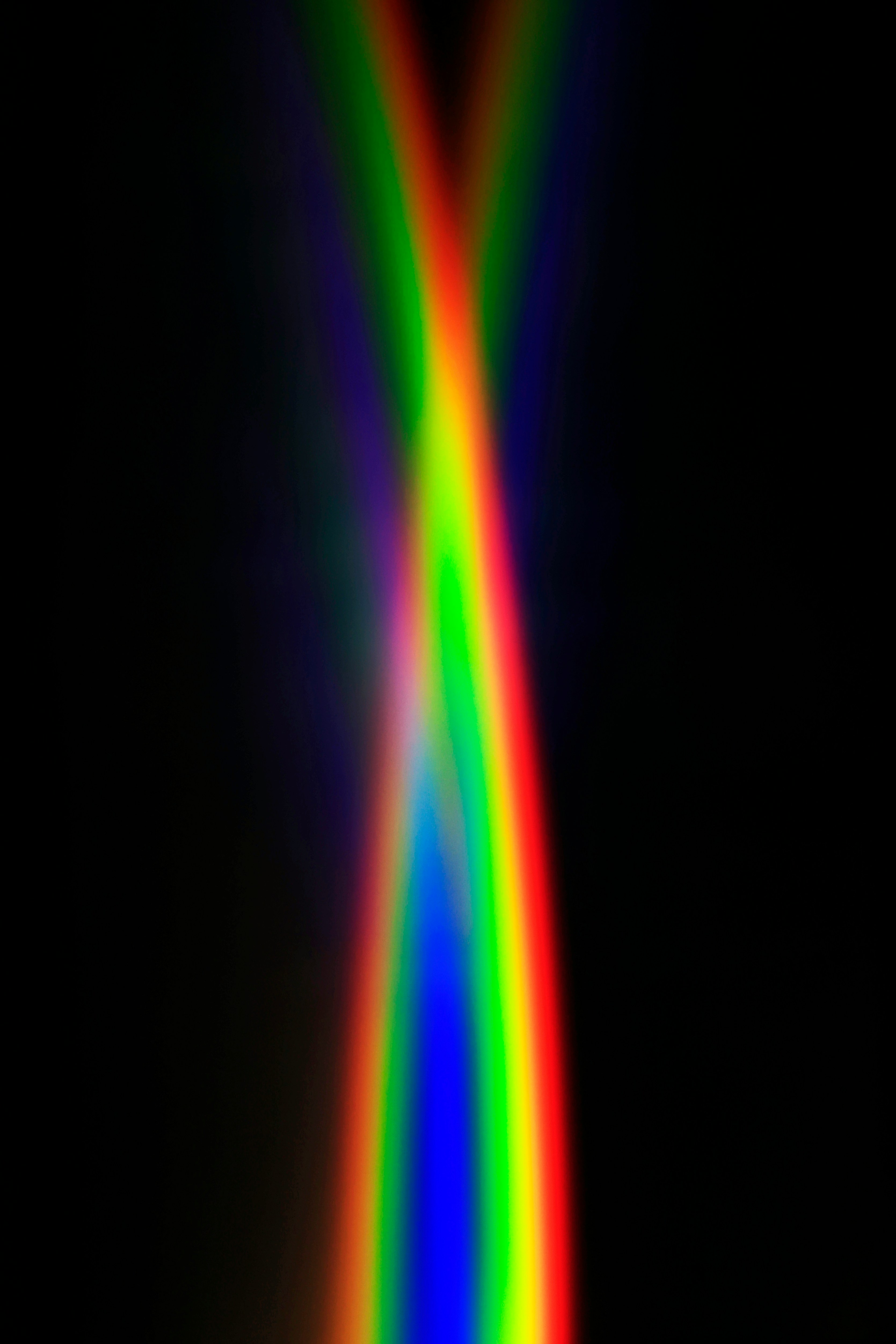
Here's something wild. The human eye contains non-visual photoreceptors called ipRGCs—intrinsically photosensitive retinal ganglion cells. These cells don't help us "see" in the traditional sense. They don't contribute to that sharp image of a sunset or a face. Instead, they send signals directly to the Suprachiasmatic Nucleus (SCN), which is essentially the brain's master clock. When we're exposed to specific wavelengths of light, the brain adjusts its production of melatonin and serotonin accordingly. Blue light—that crisp, alertness-inducing wavelength around 480nm—is fantastic for shaking off morning grogginess. But after about 4 PM? It's a disaster for relaxation. Longer wavelengths like red and warm orange, on the other hand, have a minimal impact on melatonin suppression. They allow the brain to gracefully transition into a "Parasympathetic State"—rest and digest, not fight or flight. This isn't woo-woo stuff. It's basic mammalian biology.
2. The Psychology of Color Resonance
Beyond the hard biology of photoreceptors, colors carry deep-seated psychological associations. Some of these are personal—maybe yellow reminds you of a specific kitchen from childhood—but many share universal roots. And understanding these can help you intentionally design your own emotional environment.
The "Safety" of Matte Black: In high-end wellness design, matte black isn't about being edgy or gothic. It's about "Sensory Containment." Matte finishes minimize light reflection and visual noise, allowing the user to turn their focus inward. It's a visual exhale.
The "Vitality" of Crimson: Red is known to increase heart rate and stimulate the sympathetic nervous system. In the context of personal wellness and intimacy, a touch of crimson can bridge the gap between lethargy and arousal. It's a spark, not a flood.
The "Calm" of Sage and Teal: These colors mimic the "fractal" environments found in nature—the dappled light through leaves, the gradient of a shoreline. The brain is evolutionarily wired to find these patterns safe and deeply restorative. When you see sage green, some ancient part of your nervous system whispers, "We're not in the concrete jungle anymore."
3. Chromotherapy in Retail: Choosing Your "Vibe"
When you're selecting products for your personal space in 2026, you're not just picking a color. You're choosing your "Emotional Frequency." High-resolution retail has moved way beyond basic utility. Now it's about "Chromotherapeutic Value"—the measurable emotional impact of a product's finish. Think about it. A wellness device with a soft-touch, rose-gold finish sends a radically different neural signal than the same device in high-gloss, neon green. The rose-gold whispers vulnerability, softness, and self-care. The neon green screams energy, stimulation, and maybe a hint of cyberpunk. Neither is "bad." But one will help you unwind at 10 PM, and the other will keep you wired. Understanding this distinction allows you to essentially "hack" your own mood by strategically placing specific colors in your sensory sanctuary.
4. Overcoming "Visual Fatigue"
We are currently living through a global epidemic of "Visual Fatigue." It's caused by the relentless assault of high-saturation, high-contrast digital advertising and interface design. Everything is screaming for your eyeballs. The antidote to this is "Neutral Grounding." This means intentionally incorporating muted, organic tones that give the visual cortex permission to rest. Earth tones, soft greys, muted greens—these colors don't demand anything from your nervous system. By bringing products with these palettes into your space, you're providing your brain with a much-needed vacation from the digital noise. This rest period isn't a luxury. It's essential maintenance for a high baseline of mental health and emotional responsiveness.
5. The Future: Dynamic Color Environments
Looking ahead, the next frontier is dynamic color. We're going to see environments—and eventually, personal devices—that adjust their color spectrum in real-time based on the user's biofeedback. Imagine a room that senses your elevated cortisol and subtly shifts from stark white to a restorative lavender, or a morning routine where your environment glows with energizing amber before fading to neutral focus tones. Until that technology becomes ubiquitous and affordable, the most effective tool we have is intentionality. Specifically, intentionality in our purchase decisions. We have to consciously choose the colors we live with.
6. Conclusion: Painting Your Inner World
Your brain is constantly "tasting" the light in your environment, whether you're paying attention or not. By being intentional about the visual spectrum you surround yourself with, you can actively manage your own neurochemistry. Satisfaction and well-being aren't just about what you do or what you own. They're deeply shaped by the "Chromatic Atmosphere" in which you do it. Choose your colors with the same care you choose your food or your relationships. Your brain—and your mood—will thank you for the nourishment.
Chromotherapy: How the Visual Spectrum Shapes Your Emotional Reality | MythToy Blog